
HOPE’S HOME (2025)
Marketing and Communications Coordinator
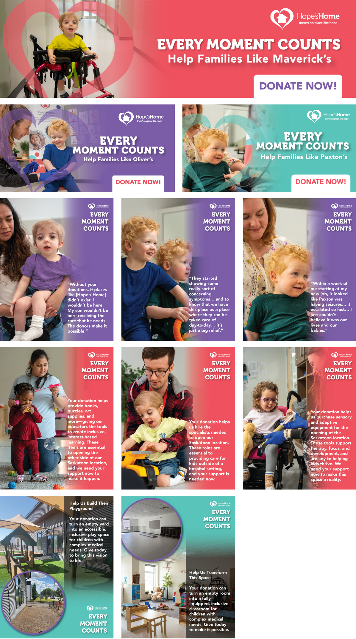
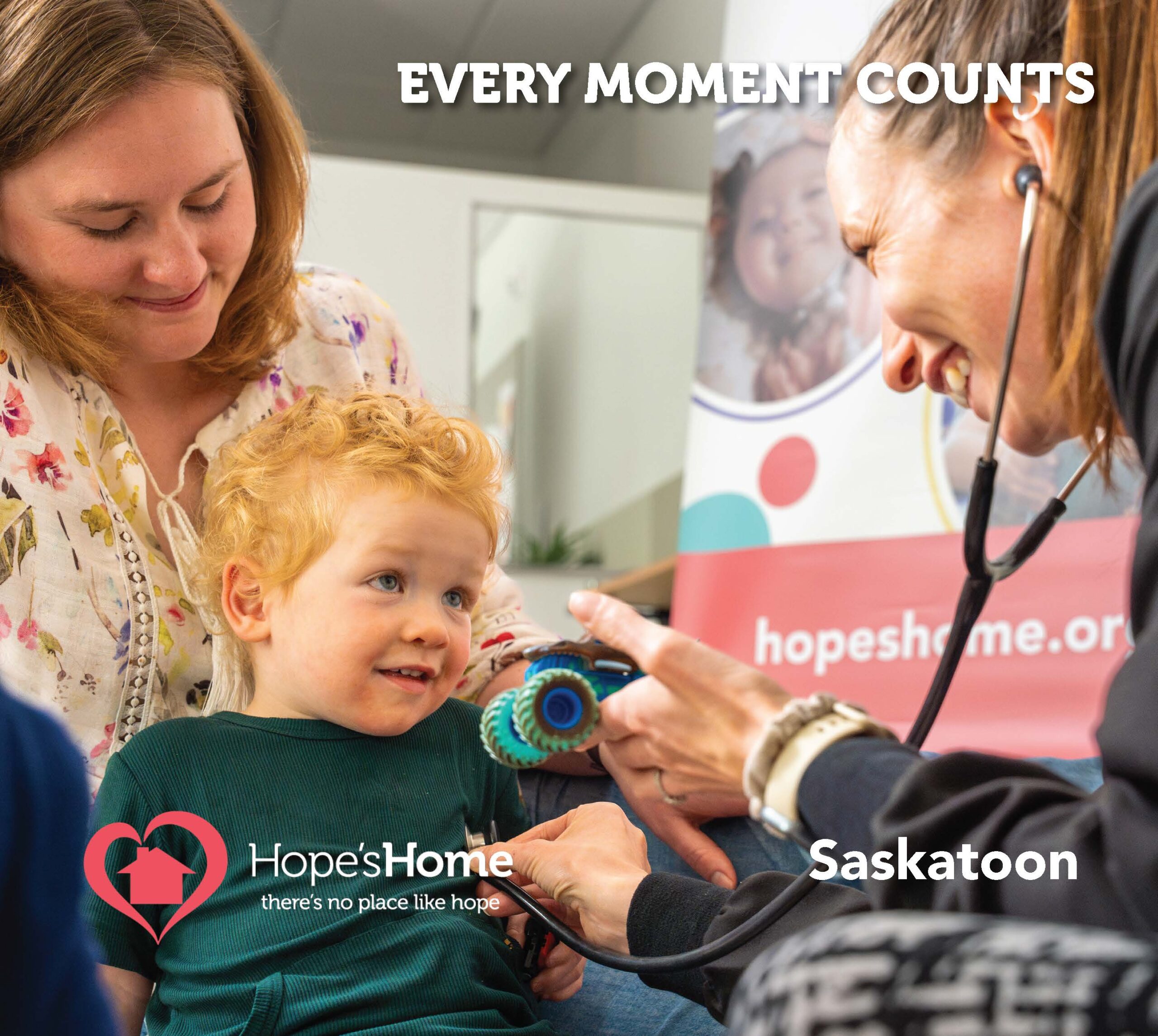
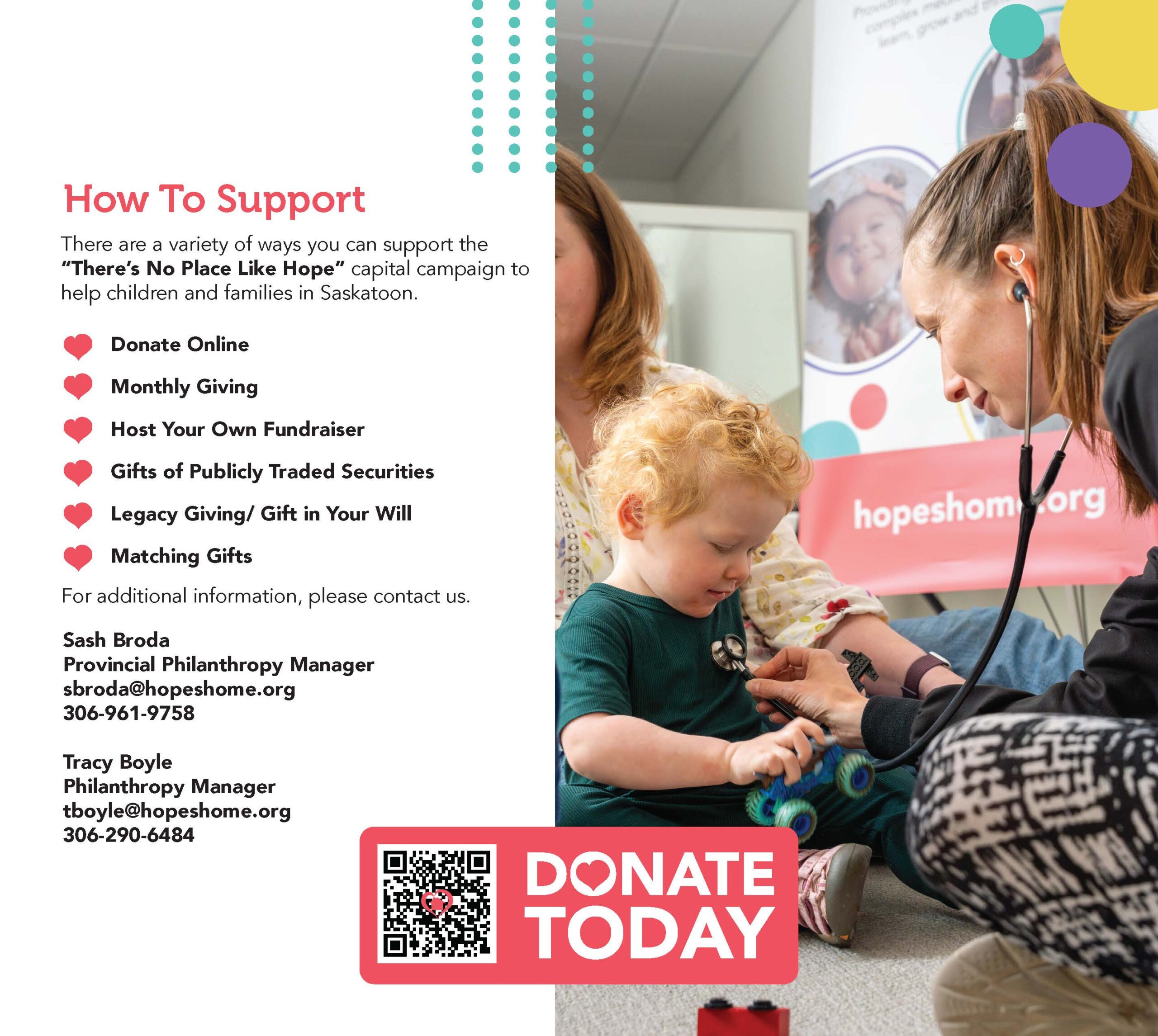
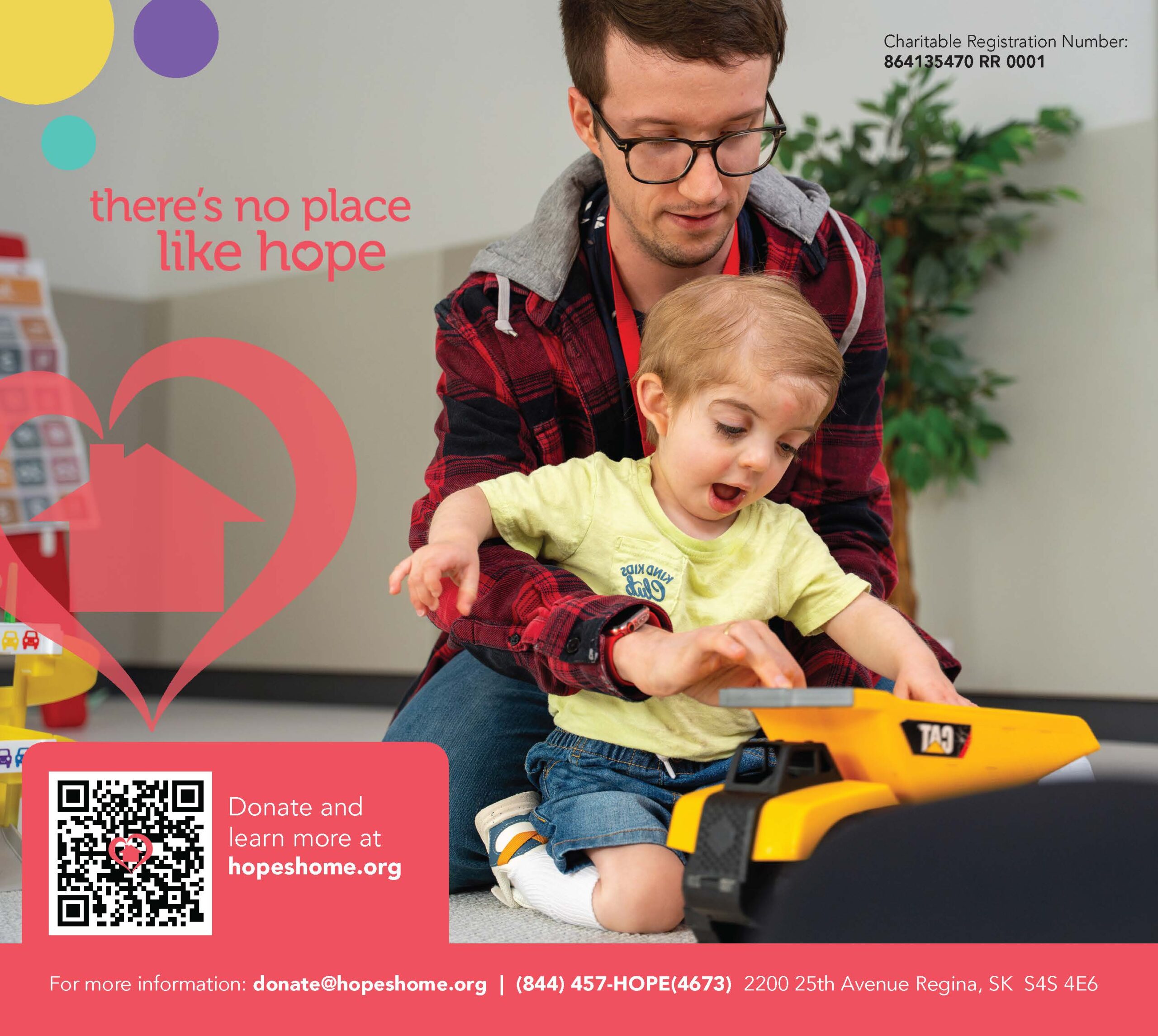
Capital Campaign – “Every Moment Counts”
Led the coordination of families, photographers, videographers, and participants to capture compelling stories for the Fall launch of Hope’s Home’s Capital Campaign.
The campaign, themed “Every Moment Counts,” was designed to inspire public donations and support toward completing the second half of Saskatchewan’s first medically inclusive child care centre. From the collected interviews, photography, and video content, campaign deliverables included social media posts, billboards, bus ads, Google ads, and other collateral. Following brand standards, bright and playful visuals associated with Hope’s Home were developed to capture attention and clearly communicate the urgent need for support.
Saskatoon Campaign Booklet
Designed and produced an informational booklet tailored to the Saskatoon location. This piece integrated updated campaign messaging and imagery to align with the overarching “Every Moment Counts” theme, while serving as a professional, accessible resource for potential donors and stakeholders.

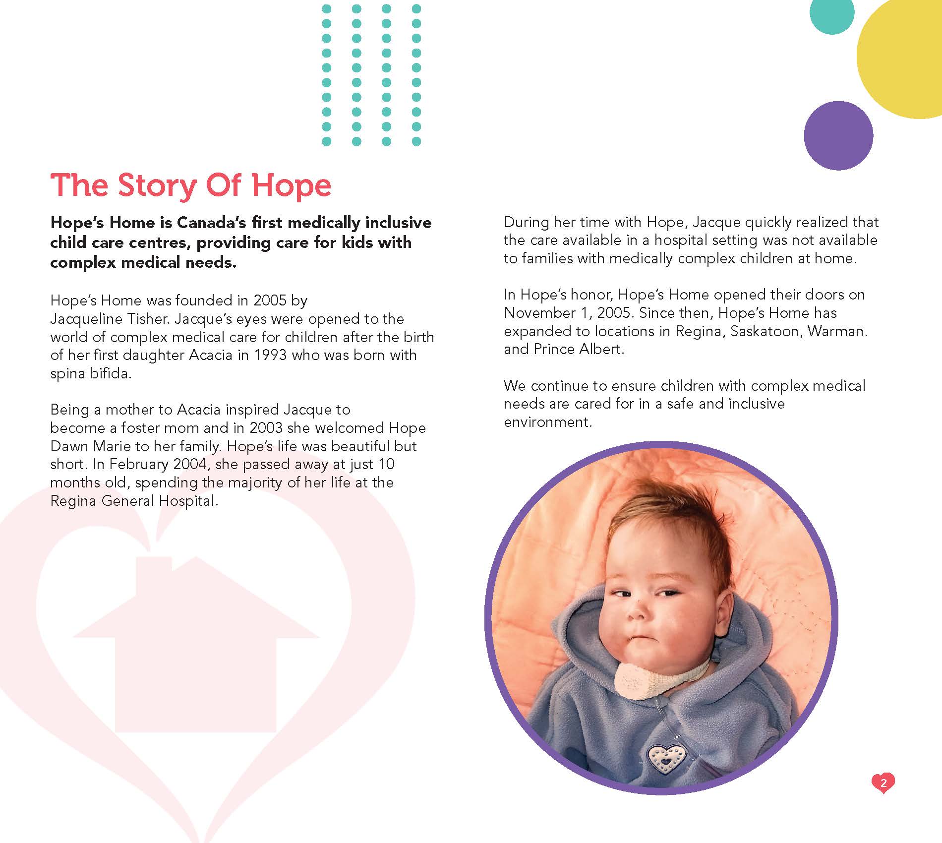
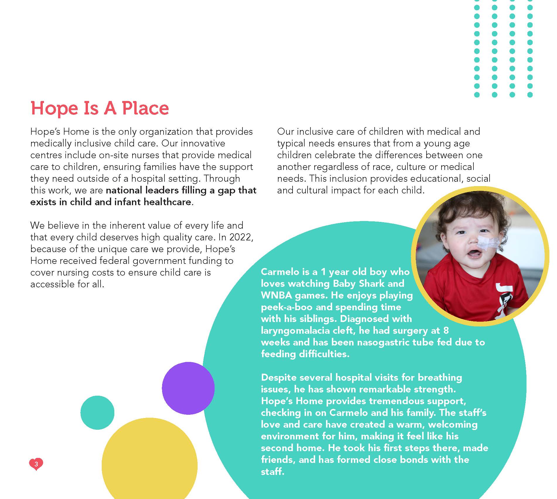
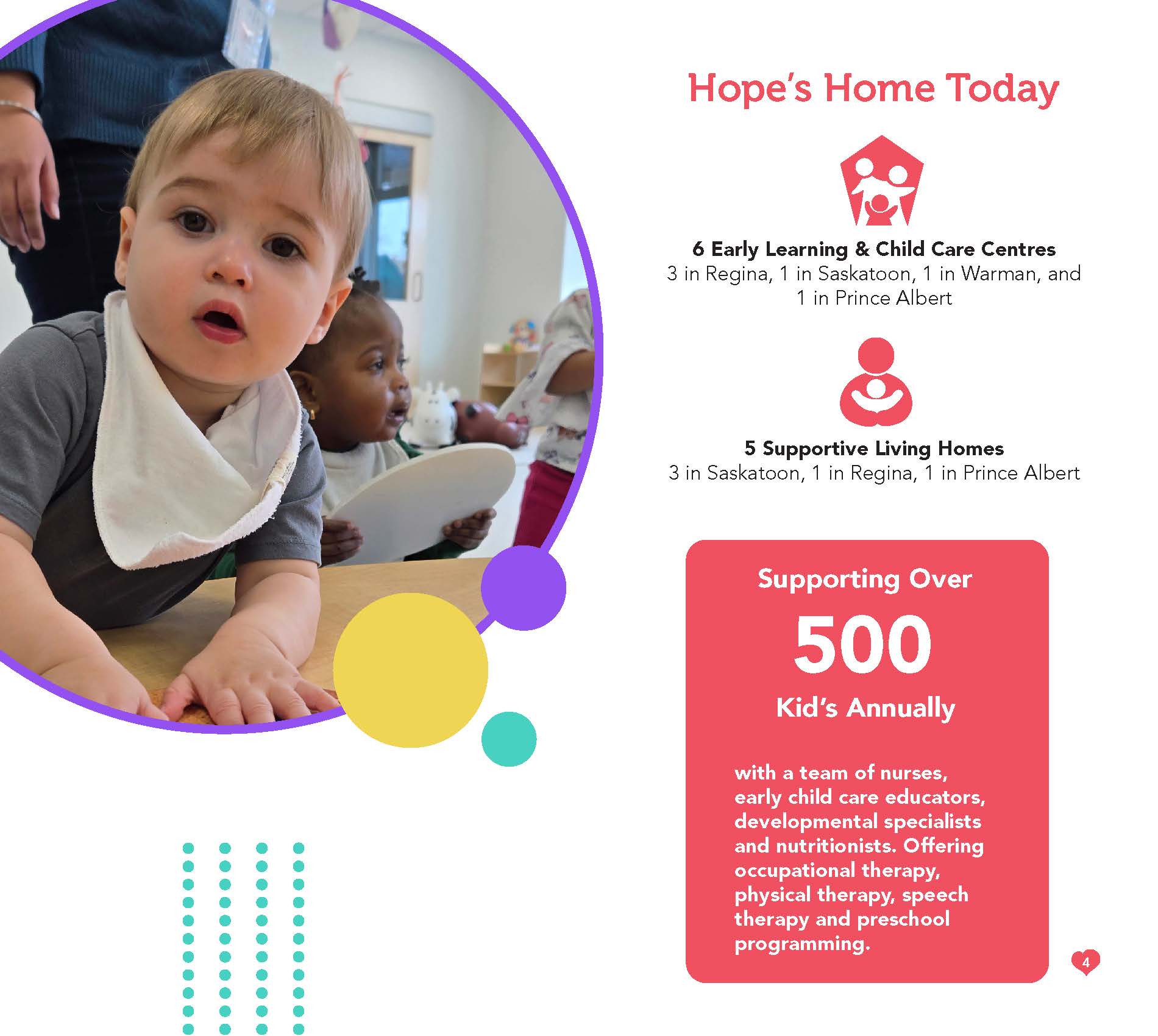
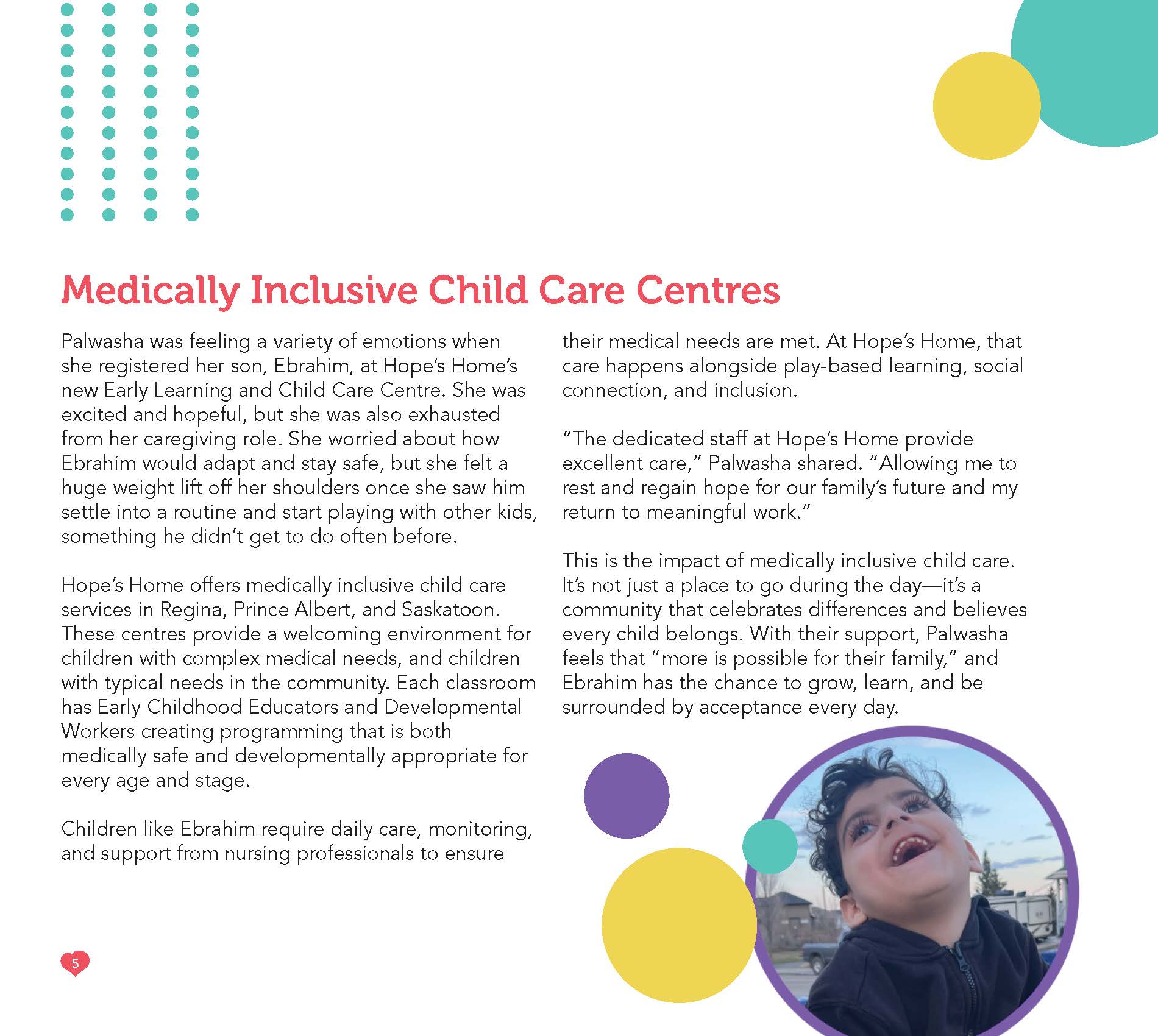
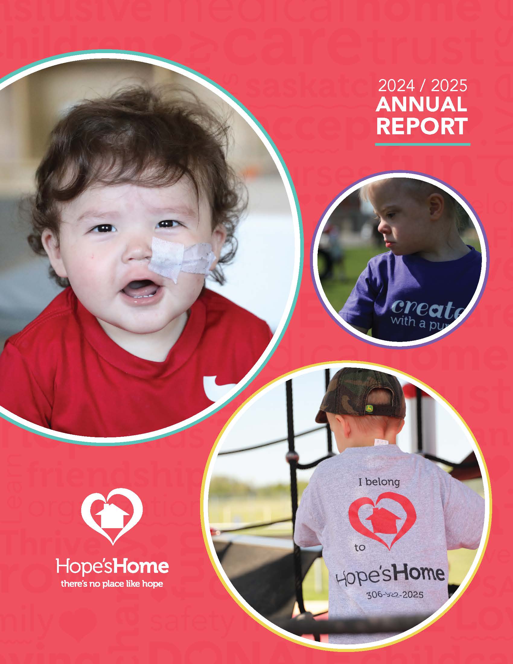
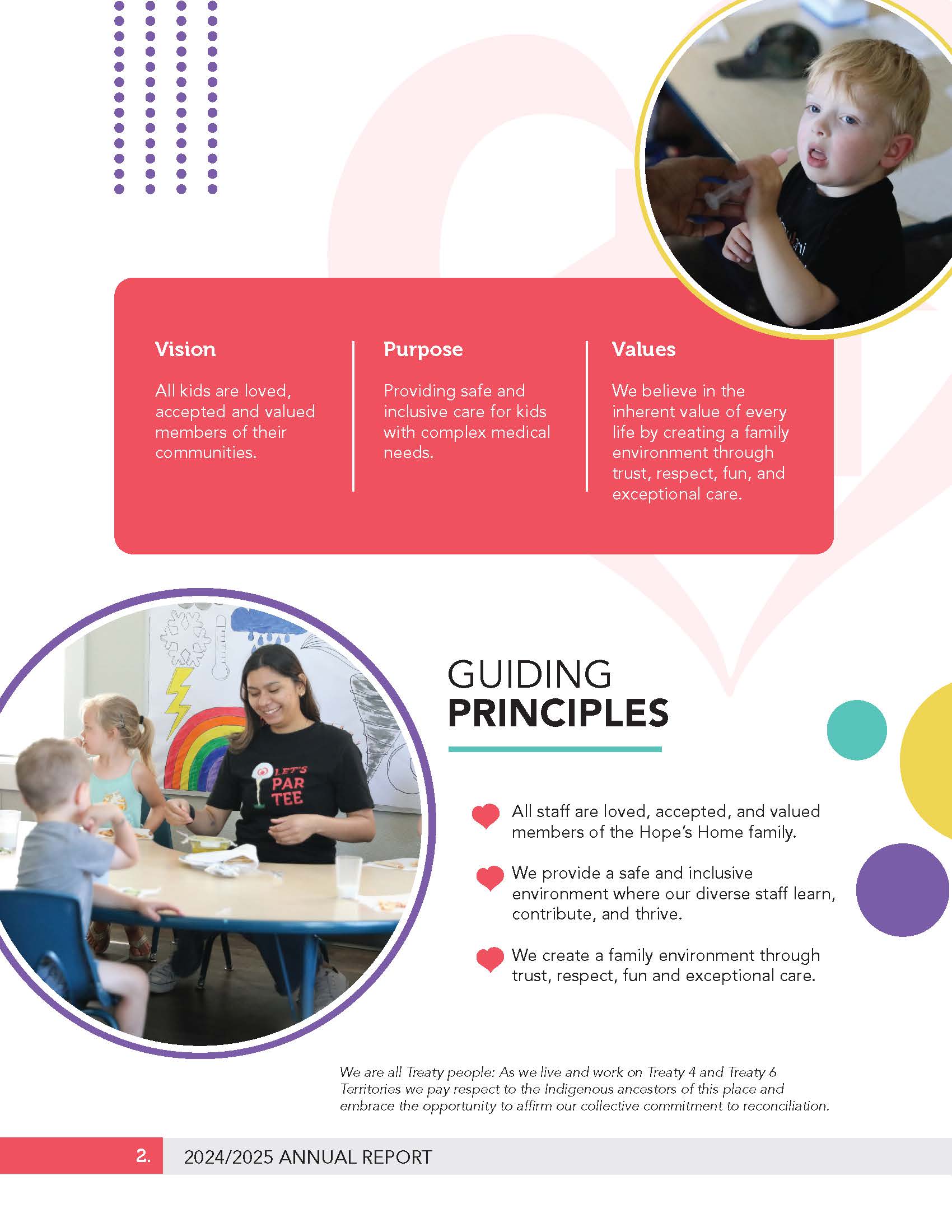
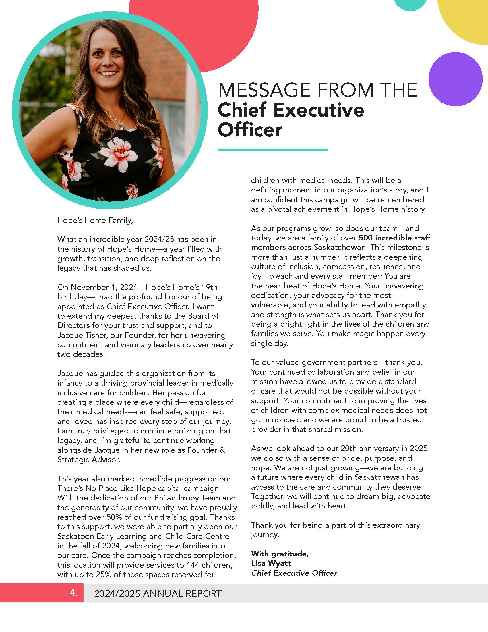
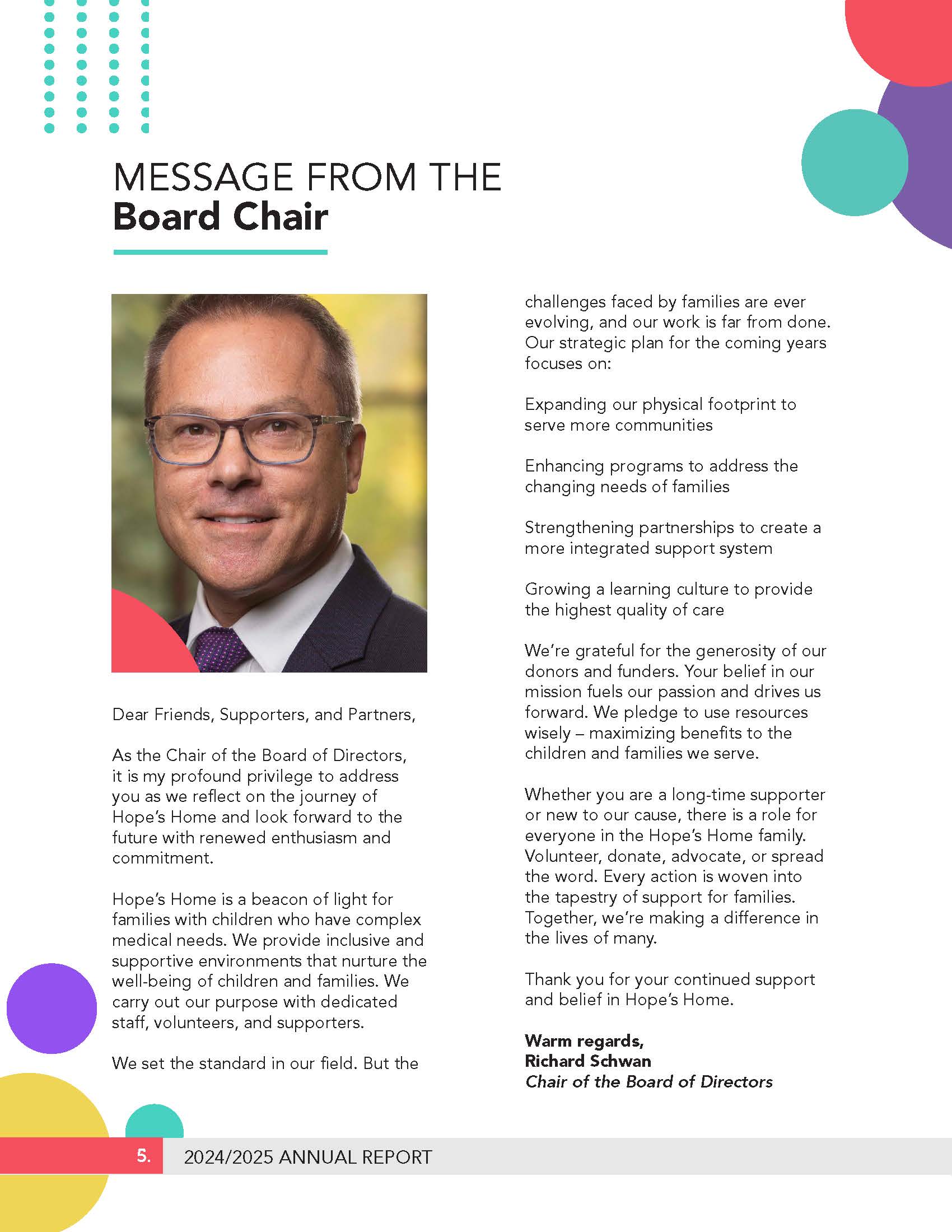
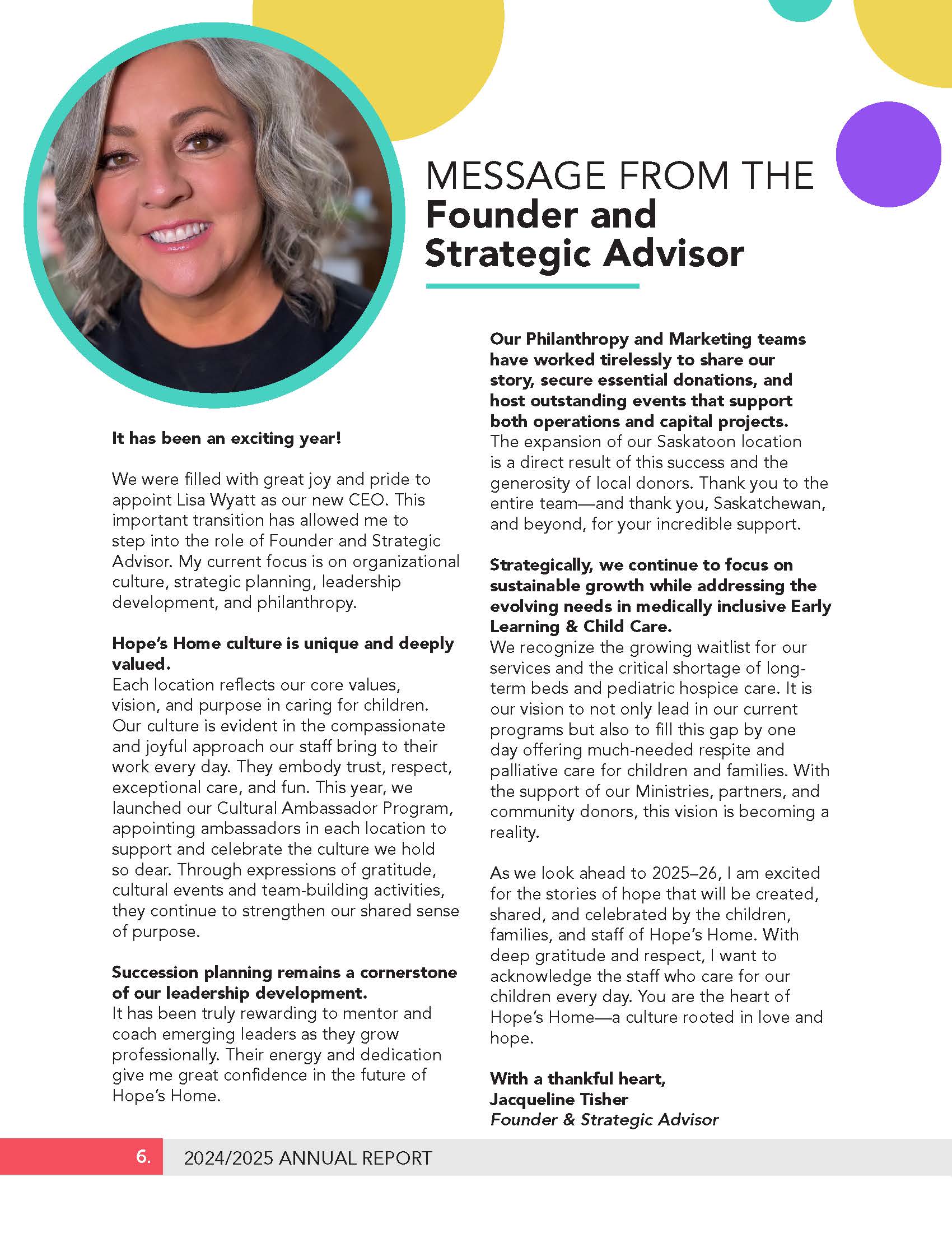
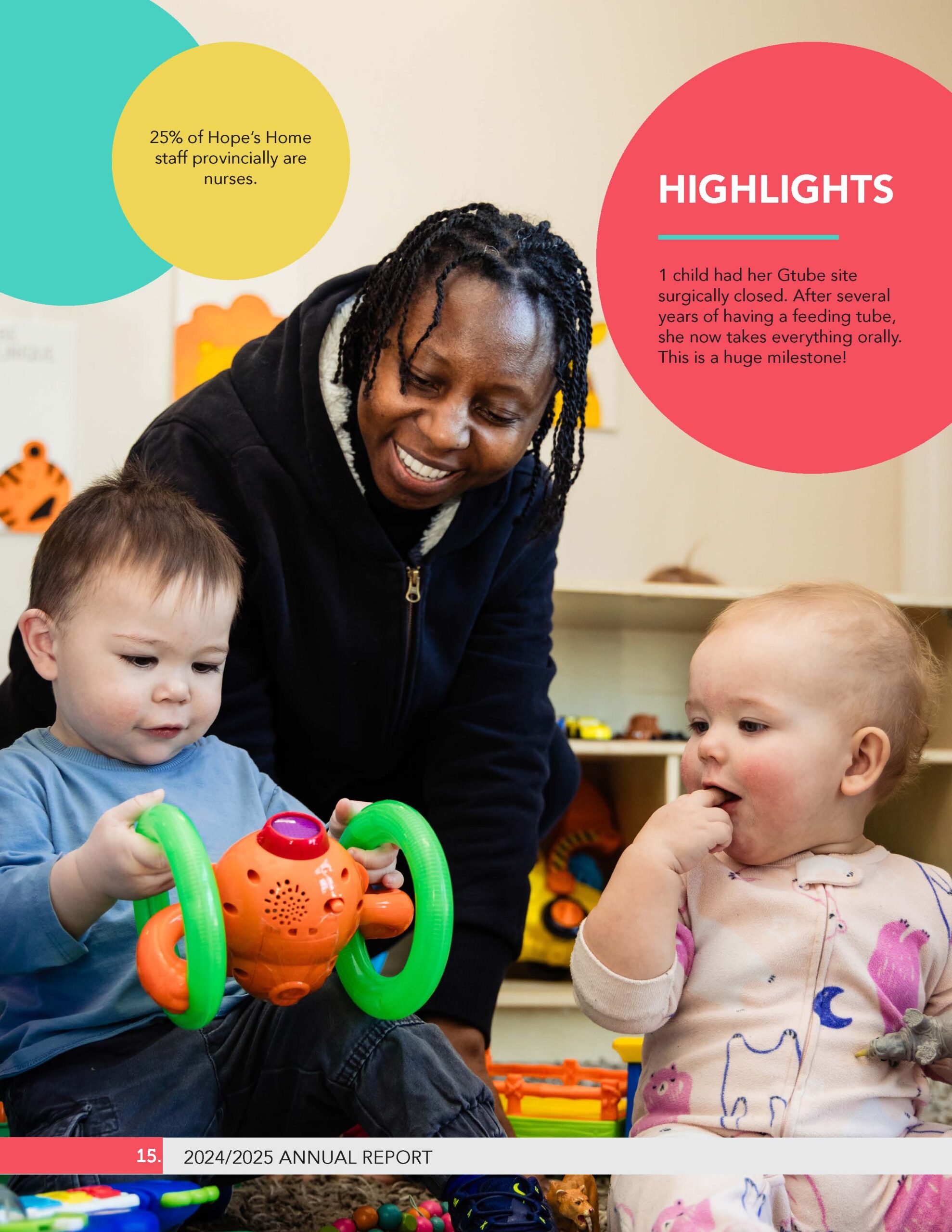
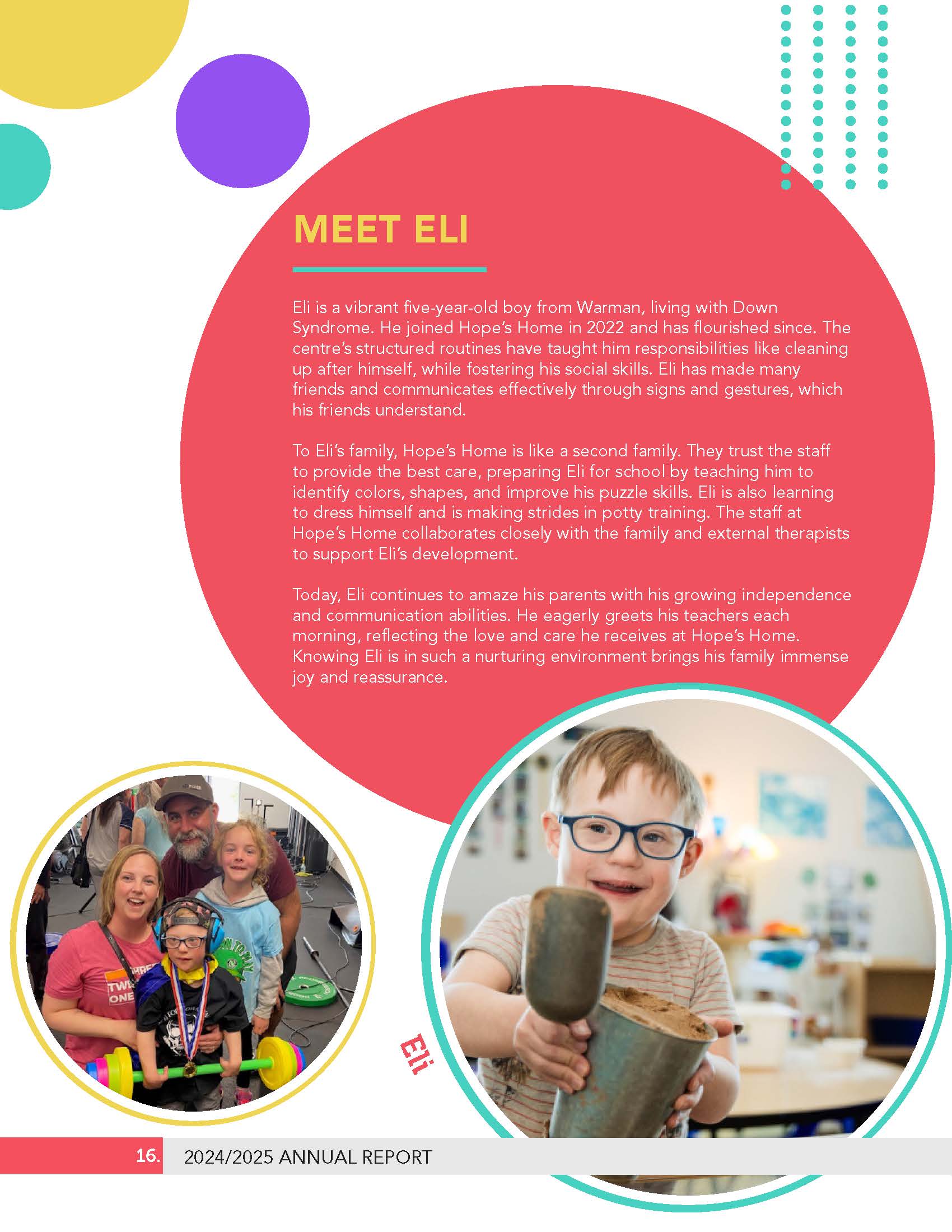
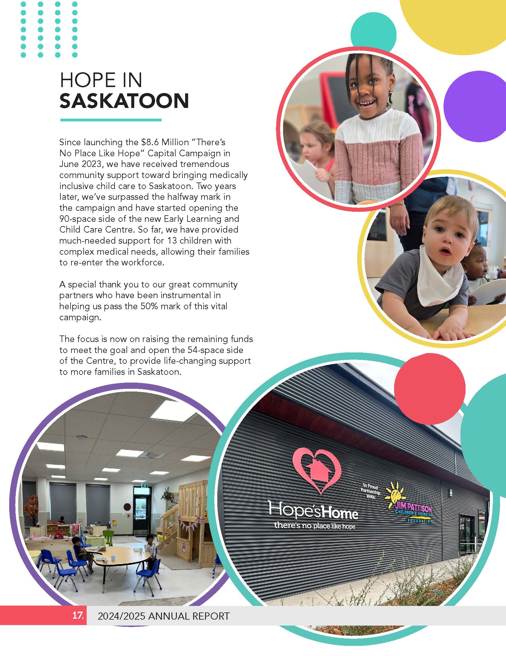
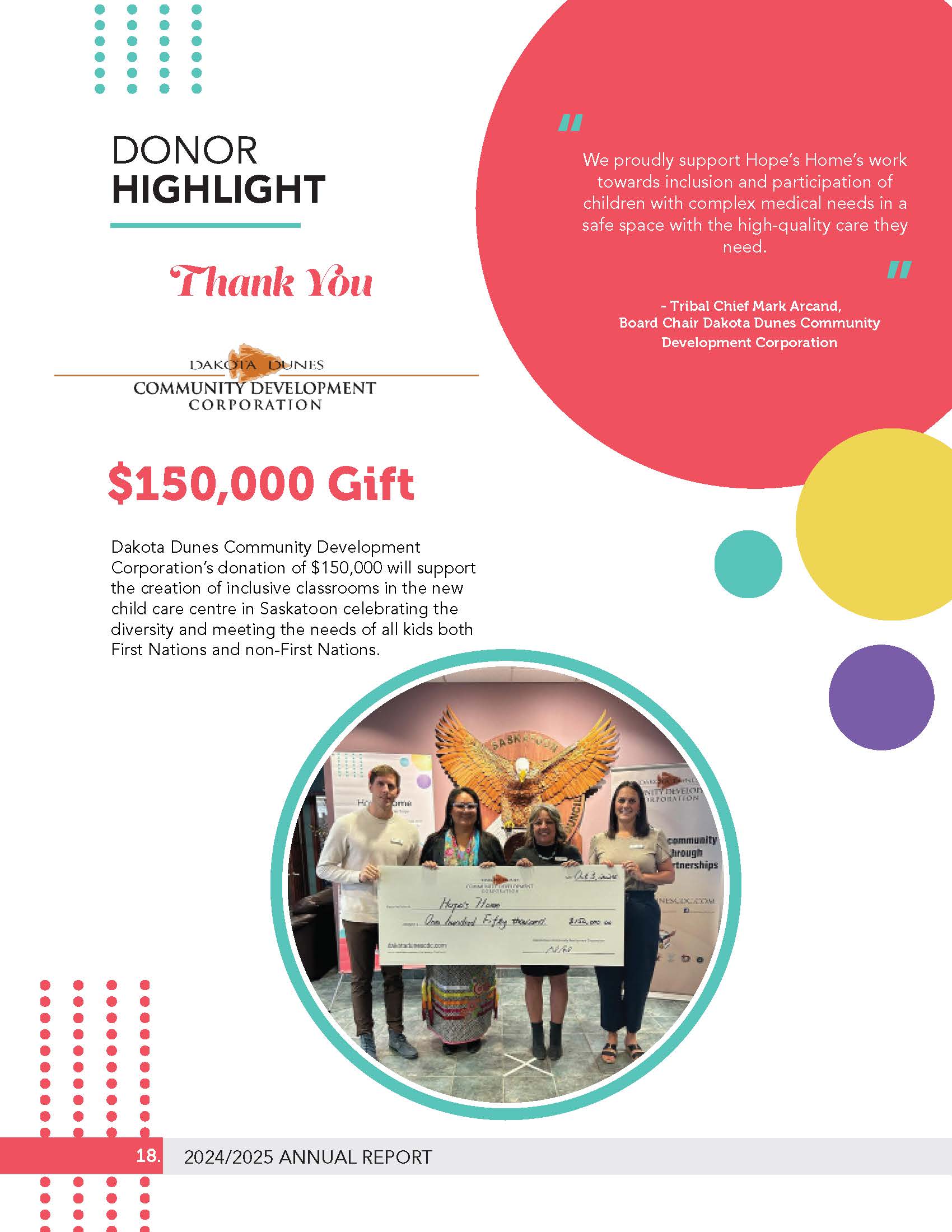
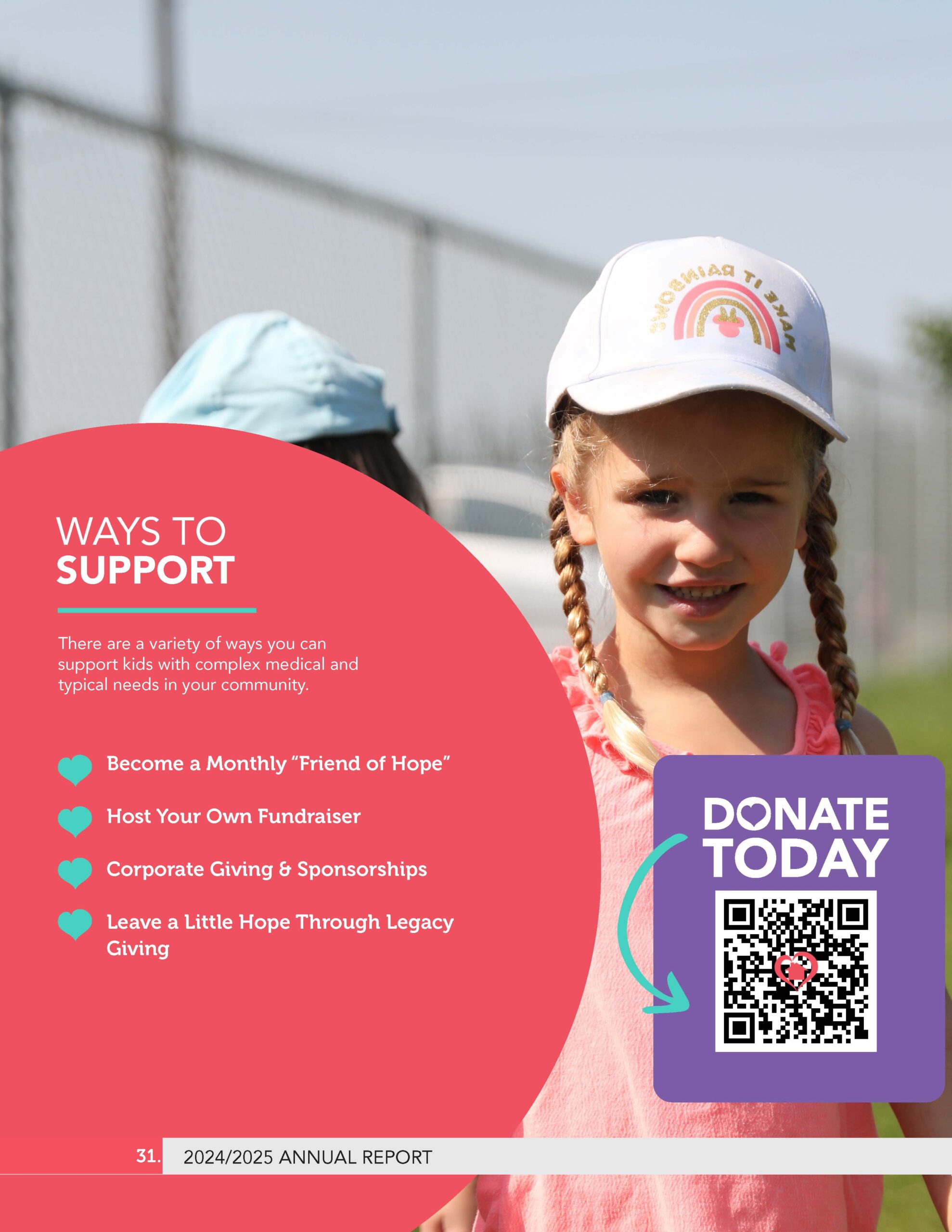
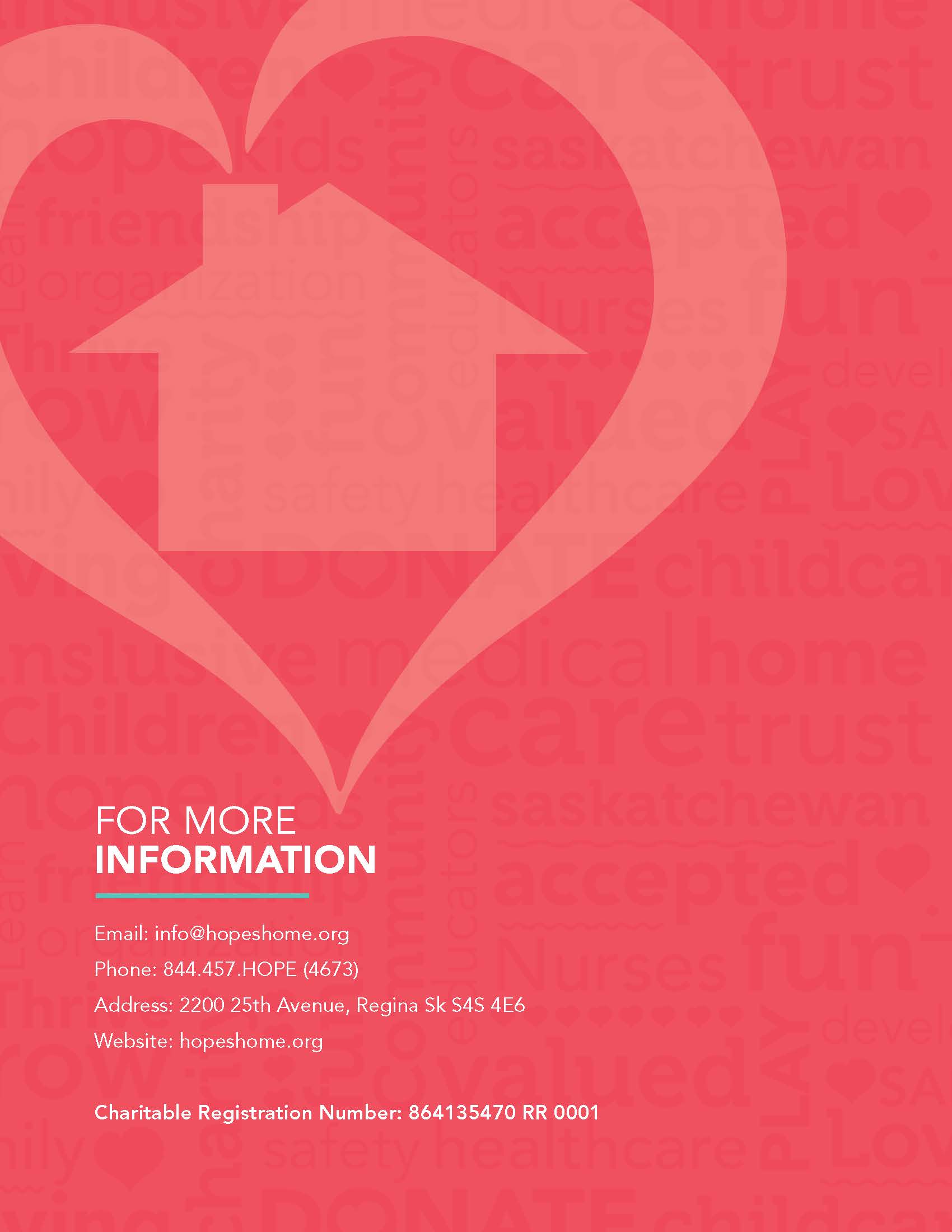
Annual Report (2024–2025)
Produced Hope’s Home’s 2024–2025 Annual Report, transforming provided data and stories into a clear, visually engaging document that reflected the organization’s impact and achievements.
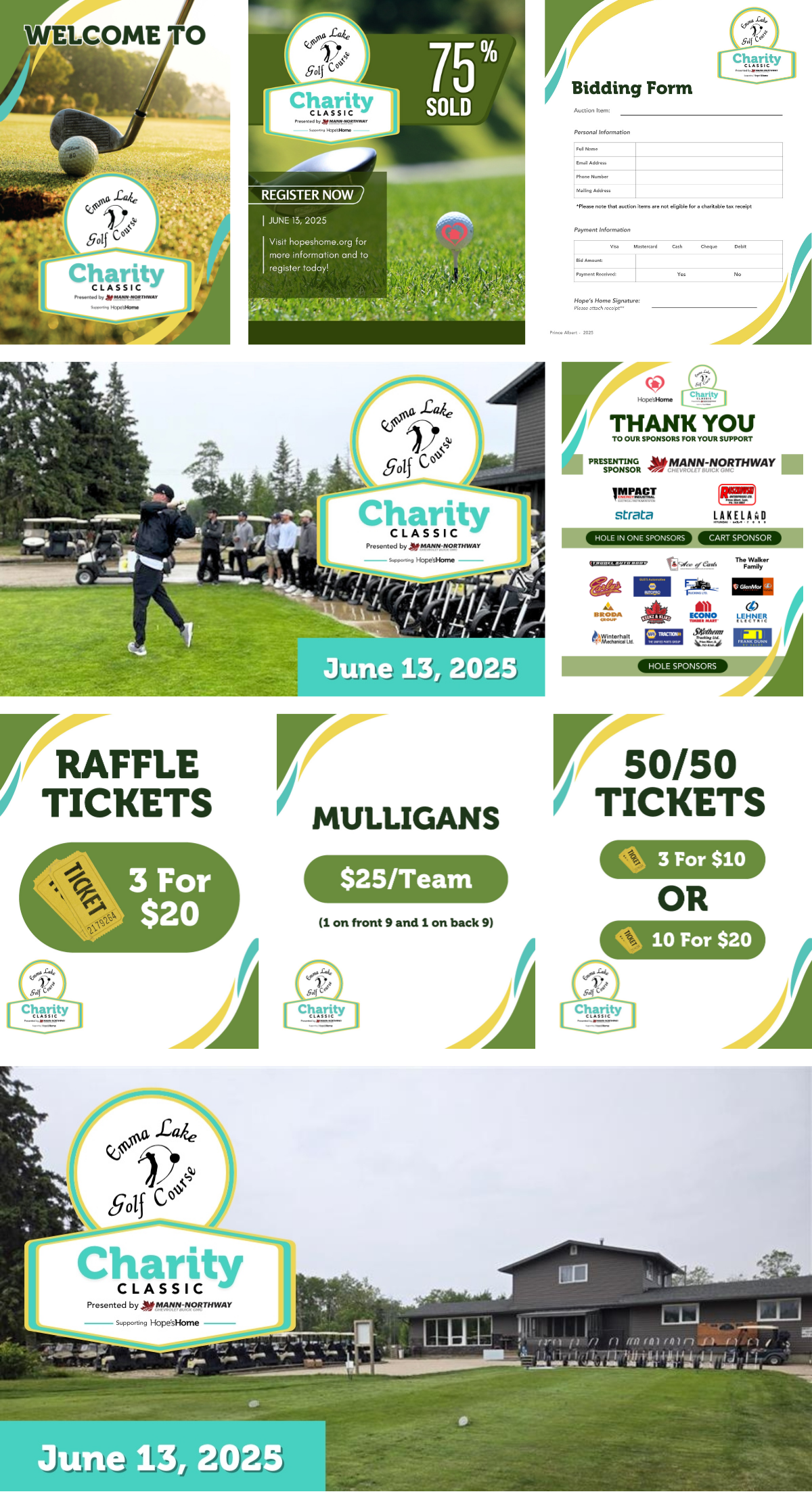
Emma Lake Charity Classic Golf Fundraiser
Developed a refreshed visual identity for the 2025 Charity Classic, including a new logo and accompanying event materials. Deliverables ranged from social media graphics and website banners to printed collateral. While distinct from the core Hope’s Home brand, the updated design provided a modernized look that built on previous years’ materials, giving the event a polished, cohesive presence.
SASKATOON PRIDE (2024)
Contract Graphic Designer
For Saskatoon Pride’s brand guidelines, I crafted a comprehensive visual identity system that embodies the vibrancy, inclusivity, and celebratory spirit of the LGBTQ+ community.
The project included defining a dynamic color palette, creating typography and iconography that evoke pride and unity, and setting consistent standards for logo usage across various applications. Each guideline element was designed to ensure Saskatoon Pride could communicate its message with clarity and impact, fostering a cohesive and memorable brand presence across print, digital, and event-related media.


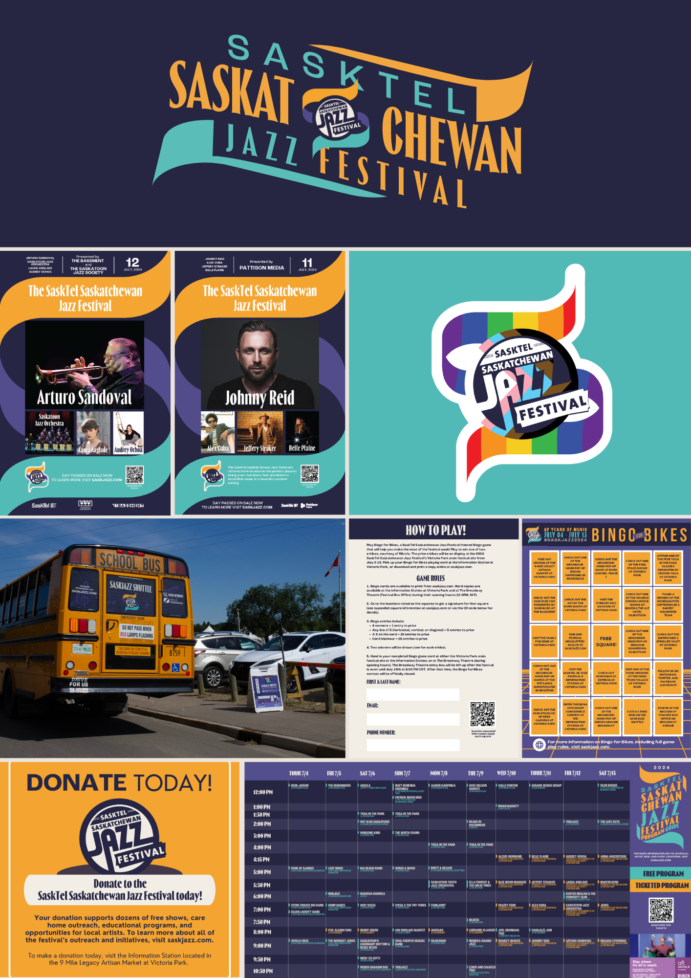
THE SASKTEL SASKATCHEWAN JAZZ FESTIVAL (2023 AND 2024)
Graphic Designer & Marketing Coordinator Assistant
In 2023, I joined the SaskTel Saskatchewan Jazz Festival as a Graphic Designer. My role involved creating branded signage, developing a detailed site map, and updating the program guide. I also contributed to event logistics by filling out event planning forms and assisting with photography and hospitality during the festival.
In 2024, I was contracted to update previous design files, but thanks to additional funding, I transitioned into the role of Marketing Coordinator Assistant. This position allowed me to focus more on my field, where I created marketing collateral, including posters and social media content. I also took on video content creation, from filming to editing, along with photography throughout the festival.
Below are samples of my work, including designs and media created for the festival.
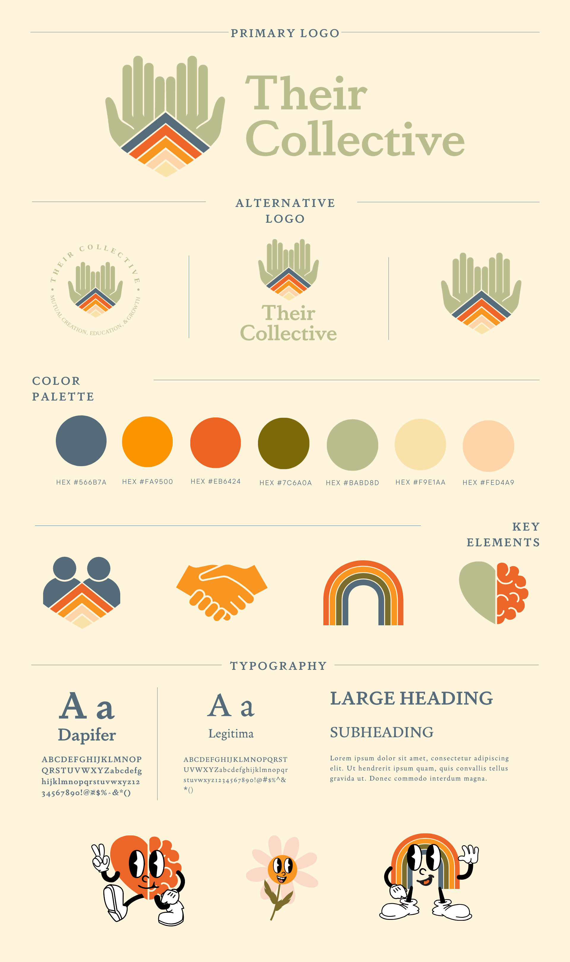
THEIR COLLECTIVE
Contract Graphic Designer
The brand identity for Their Collective was developed to reflect the collective’s mission of educating allies and supporting the queer community through workshops, merchandise, and mental health resources. The scope included designing a cohesive visual identity, comprising a logo, color scheme, typography, and iconography, with the aim of creating a welcoming, inclusive, and empowering brand presence.
Logo Design: The logo centers around hands, symbolizing community, collaboration, and mutual support—key aspects of Their Collective’s values. These hands are arranged in a heart shape, representing the creation of safe spaces, trust, and accessibility for queer individuals. A nod to the progressive pride flag is included within the design, providing clarity and visibility to the audience the brand serves, reinforcing the collective’s dedication to queer advocacy.